
The color palette for my cards is based partly on Solarized so that it's easy on the eyes whether you're studying day or night on your computer or phone. Most programming software use a similar color palette to reduce eye strain. As a coder I know the pain of staring at screens for too long.
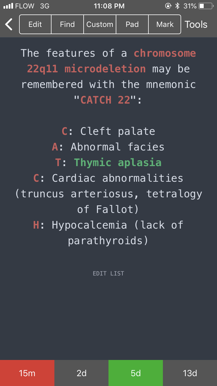
This color scheme works well for me since I learn best through color and images. Some features of this design includes different colors for key words so that you have a reduced cognitive load when reading the cards. As an added bonus, if you hover over the top of any card, the card tags will pop-up momentarily to show you which category the card belongs in. Feel free to tweak the html and css of any note type to customize it to your liking. If you break the code, just restore from a previous backup (automatic backups should be on).
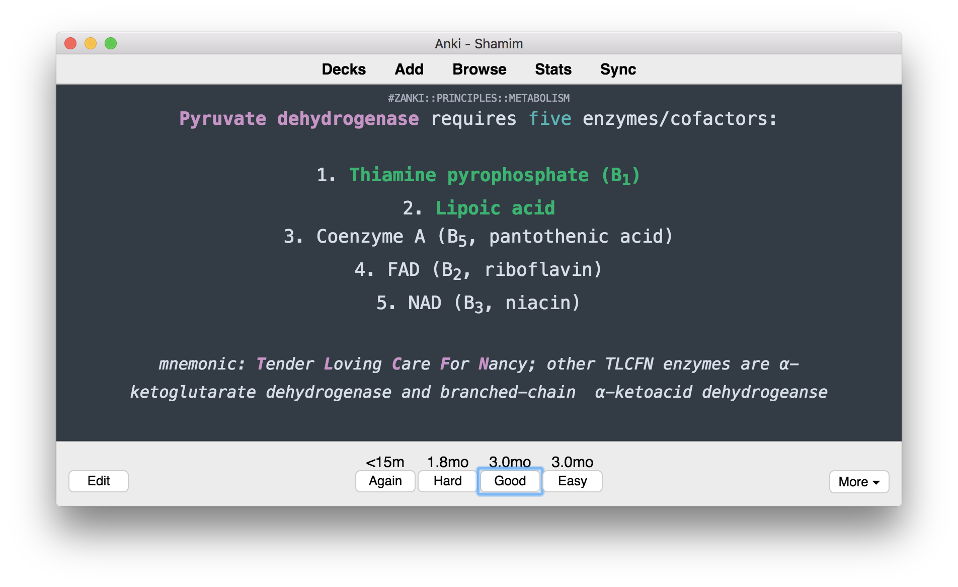


As you can see in the image above, the middle block contains the CSS and this code will apply to both the front and the back of the card. I included /*comments*/ as annotations in the code so you can tweak the style as you wish.
Style for Front and Back (CSS)
html { overflow: scroll; overflow-x: hidden; }
/* CONTAINER FOR YOUR CARDS */
#kard {
    padding: 0px 0px;
    max-width: 700px; /* CHANGE CARD SIZE HERE */
    margin: 0 auto; /* CENTERS THE CARD IN THE MIDDLE OF THE WINDOW */
    word-wrap: break-word; /* BREAKS UP LONG WORKS */
}

/* APPLIES TO THE WHOLE CARD */
.card {
    font-family: Menlo, baskerville, sans;
    font-size: 18px; /* FONT SIZE */
    text-align: center; /* ALIGN TEXT */
    color: #D7DEE9; /* FONT COLOR */
    line-height: 1.6em;
    background-color: #333B45; /* BACKGROUND COLOR */
}
/* STYLE FOR CLOZE DELETIONS */
.cloze, .cloze b, .cloze u, .cloze i { font-weight: bold; color: MediumSeaGreen !important;}

/* STYLE FOR EXTRA PORTION ON BACK OF CARD */
#extra, #extra i { font-size: 15px; color:#D7DEE9; font-style: italic; }

/* STYLE TAGS TO APPEAR WHEN HOVERING OVER TOP OF CARD */
.tags {
    color: #A6ABB9;
    opacity: 0;
    font-size: 10px;
    width: 100%;
    text-align: center;
    text-transform: uppercase;
    position: fixed;
    padding: 0;
    top:0;
    right: 0;}
.tags:hover { opacity: 1; position: fixed;}

/* IMAGE STYLE */
img { display: block; max-width: 100%; max-height: none; margin-left: auto; margin: 10px auto 10px auto;}
tr {font-size: 12px; }

/* COLOR ACCENTS FOR BOLD-ITALICS-UNDERLINE */
b { color: #C695C6 !important; } /* BOLD STYLE */
u { text-decoration: none; color: #5EB3B3;} /* UNDERLINE STYLE */
i  { color: IndianRed; } /* ITALICS STYLE */
a { color: LightGray !important; text-decoration: none; font-size: 10px; font-style: normal; } /* LINK STYLE */

/* ADJUSTMENT FOR MOBILE DEVICES */
.mobile .card { color: #D7DEE9; background-color: #333B45; }
.mobile .tags:hover { opacity: 1; position: relative;}
Front of Card (HTML)
<div id="kard">
<div class="tags">{{Tags}}</div>
{{cloze:Text}}
</div>
Back of Card (HTML)
<div id="kard"> <div class="tags" id='tags'>{{Tags}}</div> {{cloze:Text}} <div> </div> <div id='extra'>{{Extra}}</div> </div>


